
CSS Units Guide: Convert px, rem, em, and Percent Without Guessing
Learn when to use px, rem, em, and percent values, why font-size context matters, and how unit conversion supports consistent design tokens.
- #css
- #design
- #developers
- #tools
CSS units are design decisions
A CSS value is more than a number. The unit you choose affects how text scales, how components respond to context, and how closely an interface follows its design tokens.
Converting units before editing CSS helps developers compare values clearly instead of nudging sizes until they look close enough.
Pixels, rem, em, and percent
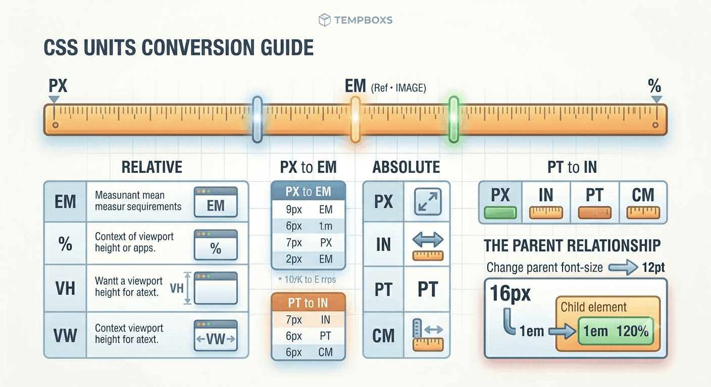
Pixels are direct CSS units. rem values are based on the root font size. em values are based on the current font-size context, usually the parent or element. Percent values are relative to the property and context being measured.
The same visual size can be written in several ways, but the maintenance behavior changes depending on the unit.
- Use px for precise borders, small offsets, and fixed details
- Use rem for typography and spacing tied to the root scale
- Use em for component-relative sizing
- Use percent for values that should follow a parent context
Root and parent context matter
If the root font size is 16px, then 1rem equals 16px. If a component's parent font size is 14px, then 1em inside that context equals 14px.
That difference is why px-to-rem and px-to-em conversions can produce different answers. A converter should let you set both root and parent font-size values instead of assuming every context is the same.
Use conversions with design tokens
Design systems often define approved size tokens for typography, spacing, and components. After converting a value, choose the closest existing token when the design intent allows it.
That keeps the interface easier to scan, avoids one-off spacing values, and makes future updates less fragile.
Where tempboxs fits
The tempboxs CSS Unit Converter converts px, rem, em, and percent values locally in your browser. It lets you adjust root and parent font sizes, use common presets, and copy conversion notes.
Use it with the Color Contrast Checker, Meta Tag Analyzer, Markdown Previewer, and Word Counter when preparing frontend updates, design QA notes, or public utility content.
Related tempboxs tools
Put the guide into practice with browser-only utilities that keep pasted values on your device.